When copyright is black and white: Rusty drops in on NPJ
If imitation is the sincerest form of flattery, as the old saying goes, then right now Neal Purchase Jnr is feeling sincerely flattered. Though that's not the only emotion he's experiencing.
A couple of days ago one of Neal's mates brought his attention to a design that Rusty were using in their latest T-shirt line. It looked awfully familiar to Neal's eyes.
In fact it was an exact replica of his 'Get Barrelled' logo except for the part where they'd scrubbed out "Designs by Neal Purchase Jnr" and replaced it with "Rusty Surf Supply Co". Even the styling - anchor, distressed print, ornate curlicue - were identical (see the two designs below).


This wasn't a matter of shared content sourced though Creative Commons or a similar platform, because, according to Neal: "I drew the design myself. It's hand drawn."
"Aside from the blatancy of it I'm just disappointed," said Neal. "I thought the surf industry could do better."
At this point he's not quite sure what's going to happen. "If I want to stop it it'll cost me $400 just to send the first letter, and I don't even know if I'd end up making that back."
As of yesterday Neal has left the dispute with his sponsor, Rhythm, to sort out. He's heard the shirts were only a limited run by Rusty but yet to have it confirmed.
As for Rusty's next T-shirt design, Swellnet suggests they adopt something fresh, something unique, such as a crossed surfboards logo...


Comments
Bit rough on NP but lucky Rusty didn't do anything even remotely brand associated with that evil company Disney. They'd be breathing down Rustys neck in seconds.
*Calling the junior designer to the corner office*
Junior designer; "But, but...I removed the scales and changed the names."
I think in this instance the word 'designer' gets scare quotation marks
haha ... rusty.... lame
coming soon
rusty-a-bong,
rusty ex machina ,
and rusty cola
Just how many t shirts = a limited run ? 1000......5000 ?
Didn't Rusty Springfield write 'Son of a preacher man'?
like a pack of lobotomised hyenas fighting over the one good scrap of an original idea.
Thats the surf media as well, present company excepted of course.
Always wondered why Warner Bros never picked up on Rabbits WB logo.
They did. Rabbit and the Hot Stuff guys had to stop producing it. Think the Paskowitz' were somehow involved, as in they were connected to Warner Bros and saw no wrong with the logo, but by that stage the lawyers were onto it and there was nothing they could do.
yeah but.... how many times did NPJ scratch the R. symbol into his desk at school as a kid?
guilty as charged
I like Neals logo, it's a nod to the Coopers beer logo but recreated in a clever way, and original - almost like the pop art of the 60's (a case in point would be Andy Warhols soup cans). Warhol is quoted for having said: "I'd rather buy a dress and put it up on the wall, than put a painting, wouldn't you?" - but I think if Andy was still here today he would be hanging NPJ's beautiful surfing creations in an art museum rather than that cheap 15 minutes of fame Rusty Tee.
good pick up that it's based on the Coopers Logo, I wouldn't have seen it otherwise. But agree a very clever adaptation of the design & homage to a great Aussie beer.
Be careful guys. This might go all 'Spicks and Specks' and the the same may happen to NPJr that happened to Men at Work when the tv show inadvertently pointed out the flute riff in their song 'Down Under' was 'borrowed' from 'Kookaburra sits in the old gum tree'.
NPJ loved the S.A. desert and loved his icey cold.............beers
I'll give you one.
Gotye - Somebody That I Used To Know is Baa Baa Black Sheep!
Total rip off..Rusty you guys suck!
Rusty minds thinking nothing original, barrels barrels barrels
they ripped this off a small operator in Bali yokii
http://photos-e.ak.fbcdn.net/hphotos-ak-prn2/t1.0-0/p200x200/1545052_101...
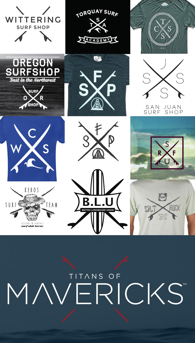
Surf comp at Avoca today getting in on the crossed surfboards logo action.
Can't stand those diagonal crossed surfboards/crossed dividers logos. The sooner they are out of fashion the better.
Wonder how many other surf comps are gonna use crossed boards in their logos this year? Just past the halfway mark in January and we're already at a count of two.
How good is the barrel n the Surfarama poster. So roomy. Throwing square with a slopey base , different but very appealing. Got to be a beachie ?
Crossed surfboards - Tres Hardcore.
Does crossed French Fries count?? I think so!
More crossed surfboard logo action!
.... and another three minutes on Google brought up these extras:
Last year's Avoca surf comp has gone with with the same design again, slightly tweaked.
Titans of Mavericks are in on the (crossed surfboard) act too.
All of these graphics are very "clipart" and not creative in any respects. NPJ probably 'sourced' the barrel from somewhere and so has no claim to its usage. Rusty should be smacked for being so blatently obvious and the crossed surfboards is so old hat and so used and used and used that no one cares. There is some great designers in the surf industry but all of the above graphics are very typical of our industry at this point in time. $$$$
Typical of the surf industry = bland unoriginal
Practicly laughable - typical of surfing Australia, Vic, NSW etc. Just so bad !!!
Just received a press release:
"Surf Lifestyle Brand Psycho Tuna Signs WSL Championship Tour Wildcard Carlos Munoz"
Psycho Tuna? Like, Hot Tuna?
A quick Google search shows that Psycho Tuna is a "Global Lifestyle Brand that inspires a life well lived and powers discovery through effortless style."
The logo looks familiar too...
But, apparently it's all intentional. In an interview with Shop Eat Surf back in 2020:
"Psycho Tuna is aiming to reach the surf, fish and boutique markets. It’s the brainchild of Patricia Thornton and her boss at denim manufacturer Ring of Fire, Eran Bitton.
Patricia most recently spent nearly 10 years at Maui & Sons and helped revive that brand at core surf stores and high-profile accounts like PacSun.
The Psycho Tuna name plays off the Hot Tuna brand from the 1980s.
Patricia is a long-time surfer, so she wanted the brand to cover the surf market. The Ring of Fire VP of Development is an accomplished bass fisherman, so that’s where the fishing element comes in."
https://shop-eat-surf.com/2020/02/industry-sales-veteran-launches-new-br...
Psycho tuna,
Qu'est-ce que c'est ?
Fa fa fa fa...